Good things take time.
Slow Burn is a romance trope reimagined as a coffee brand.
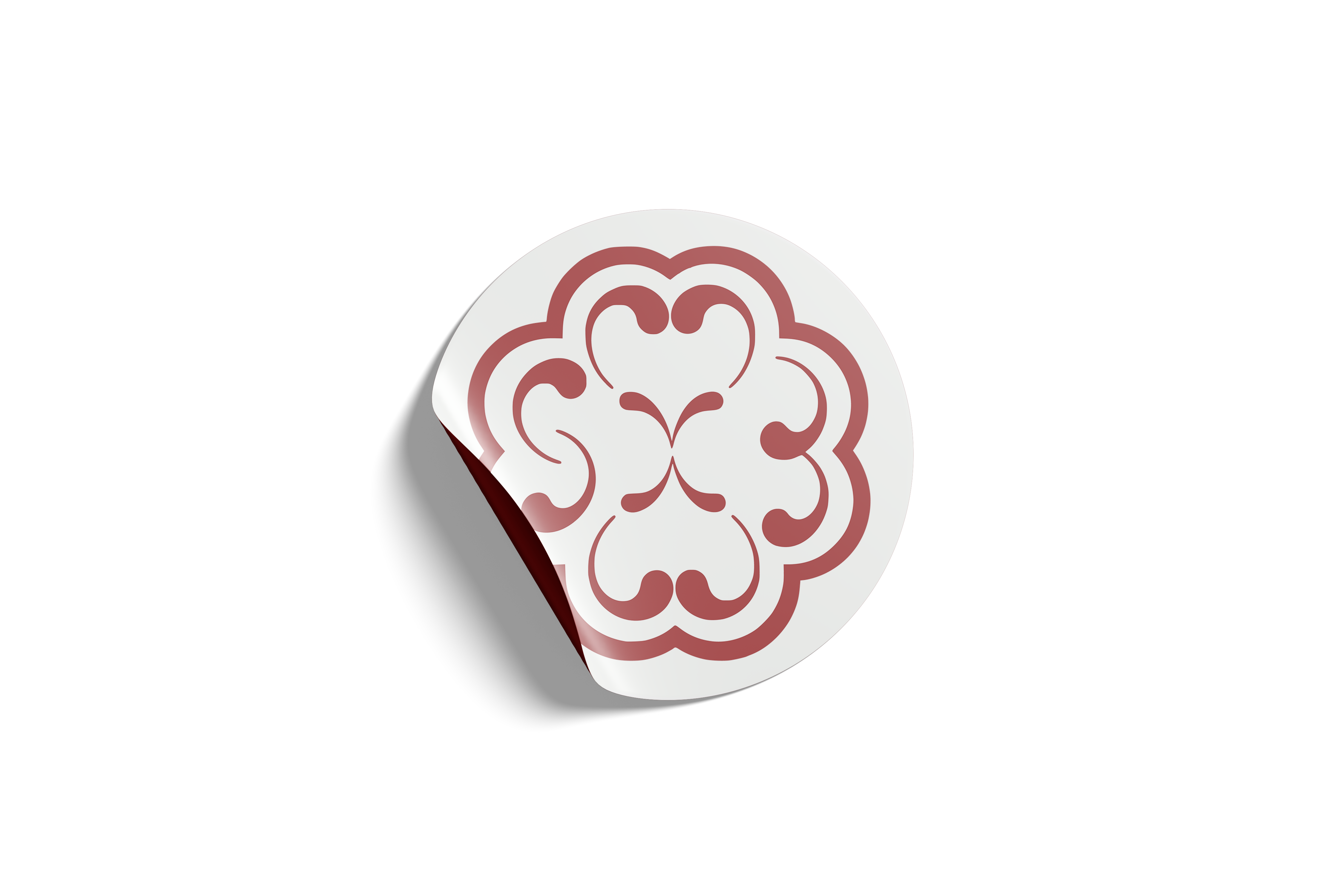
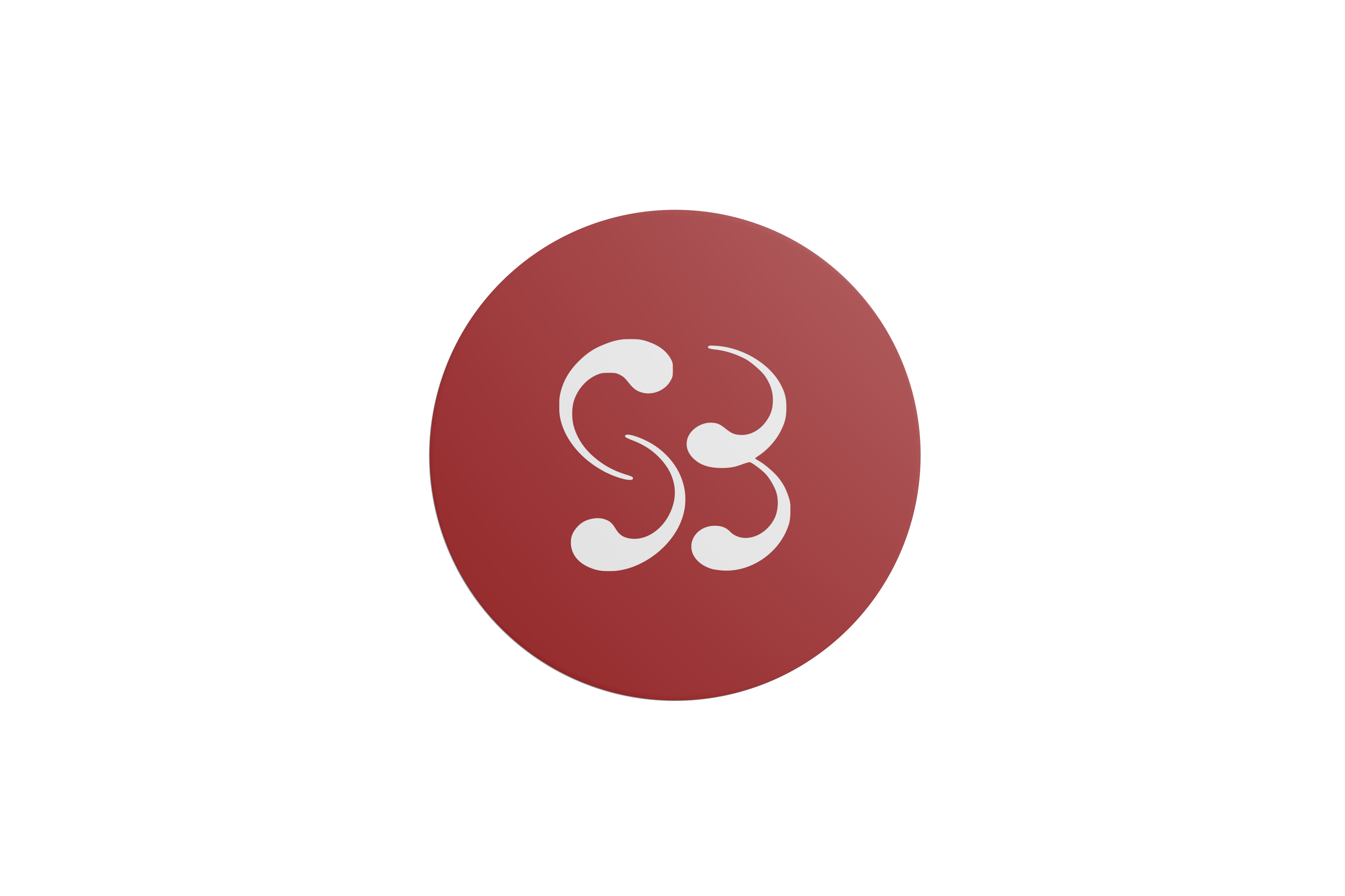
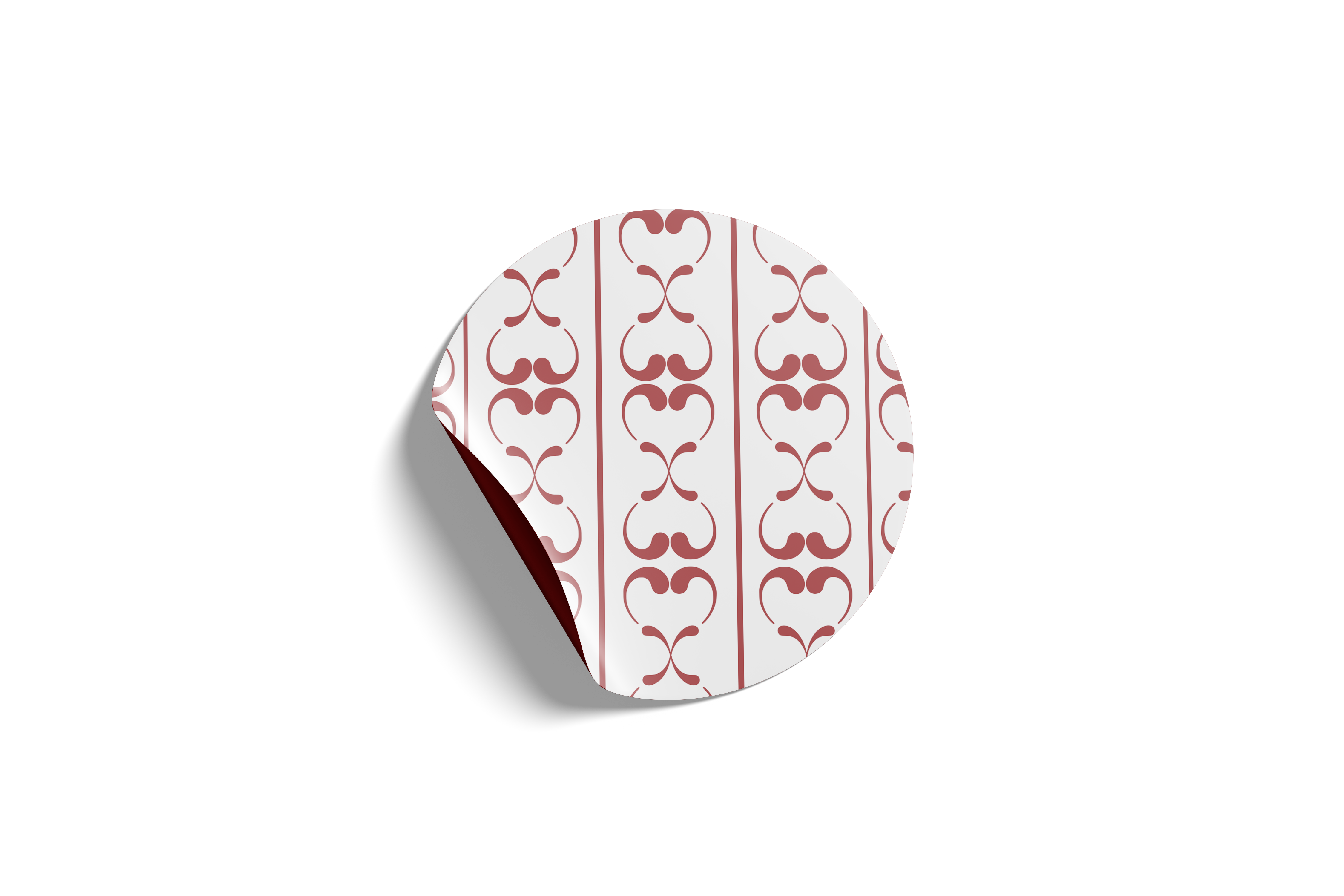
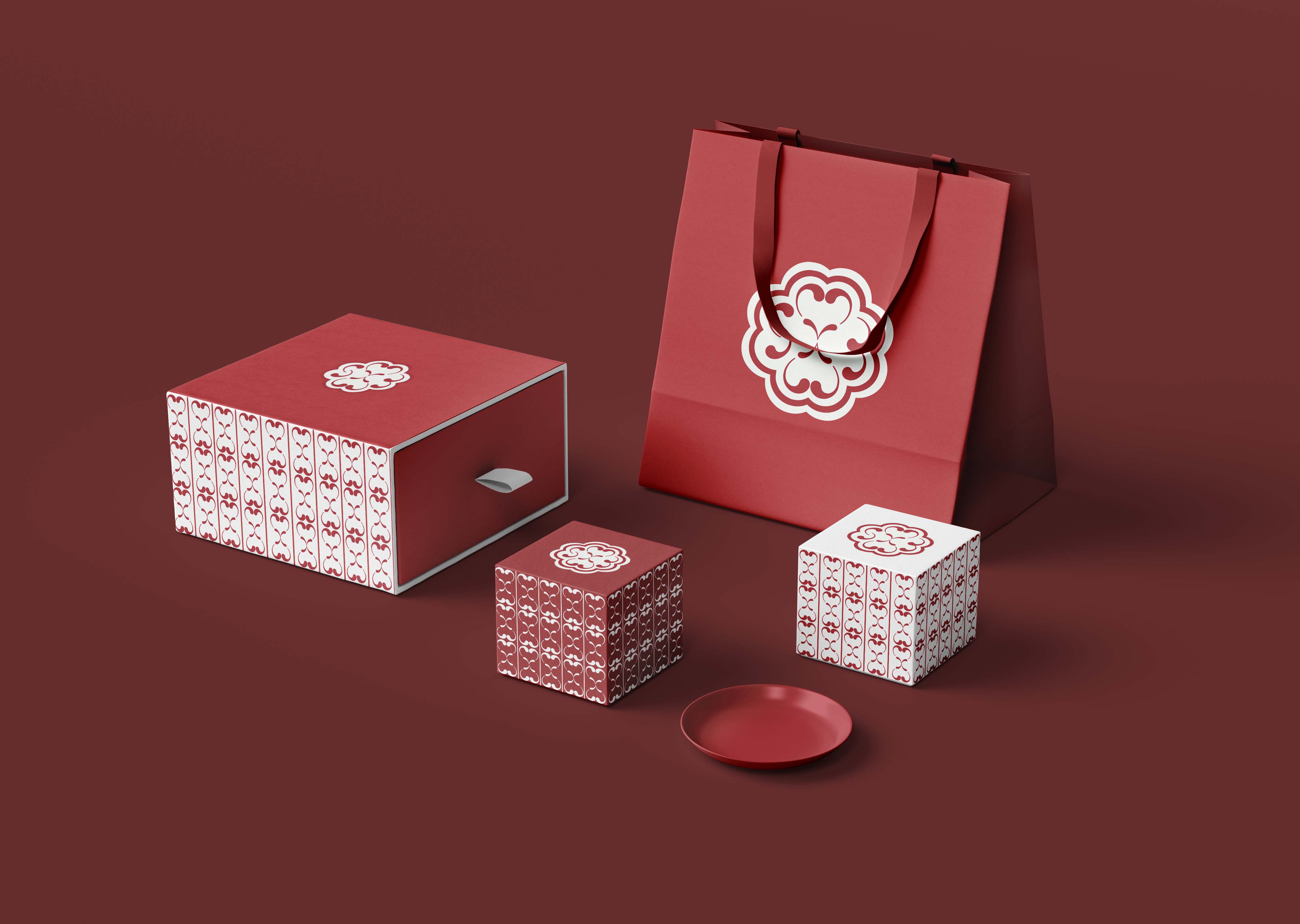
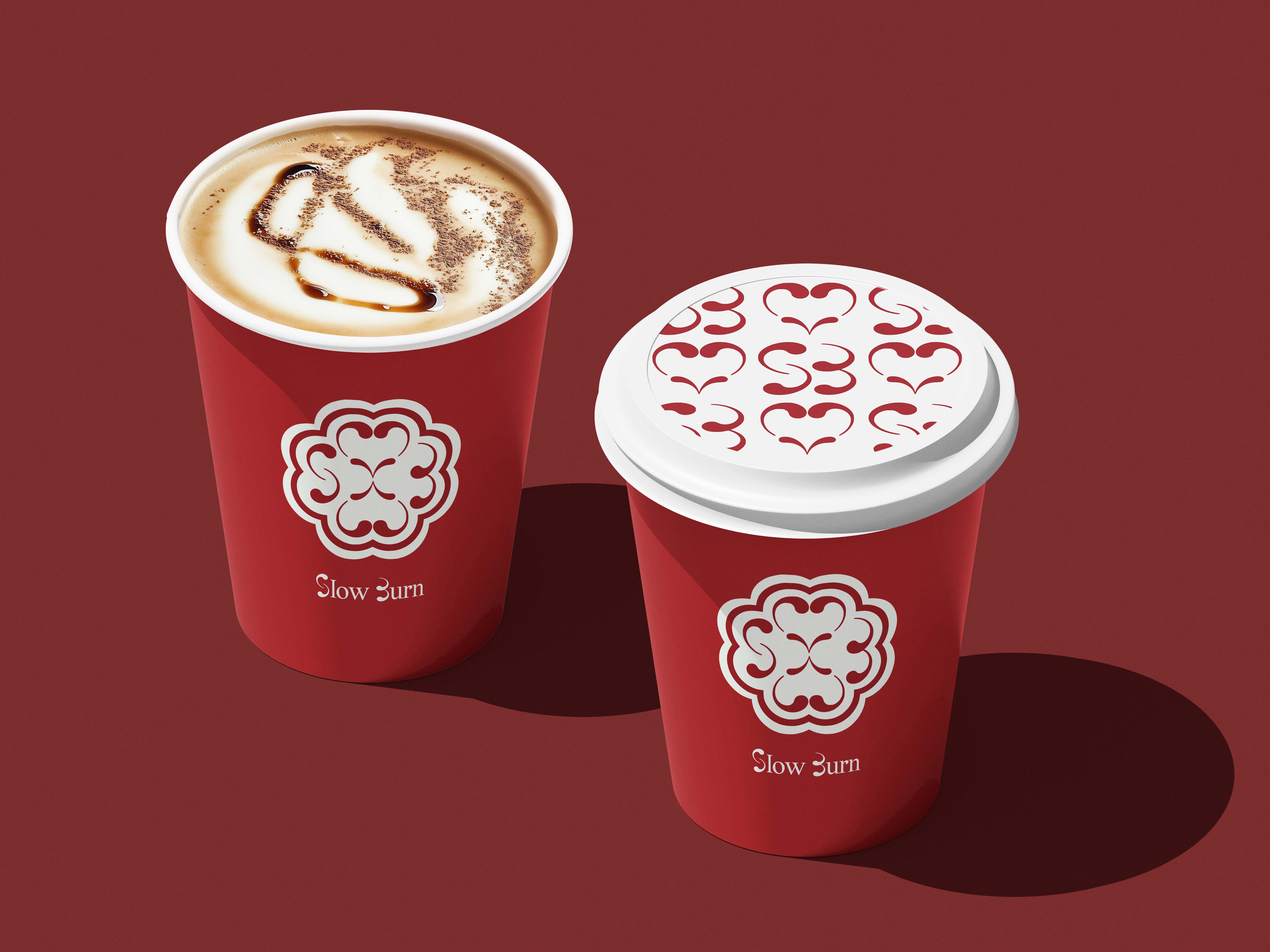
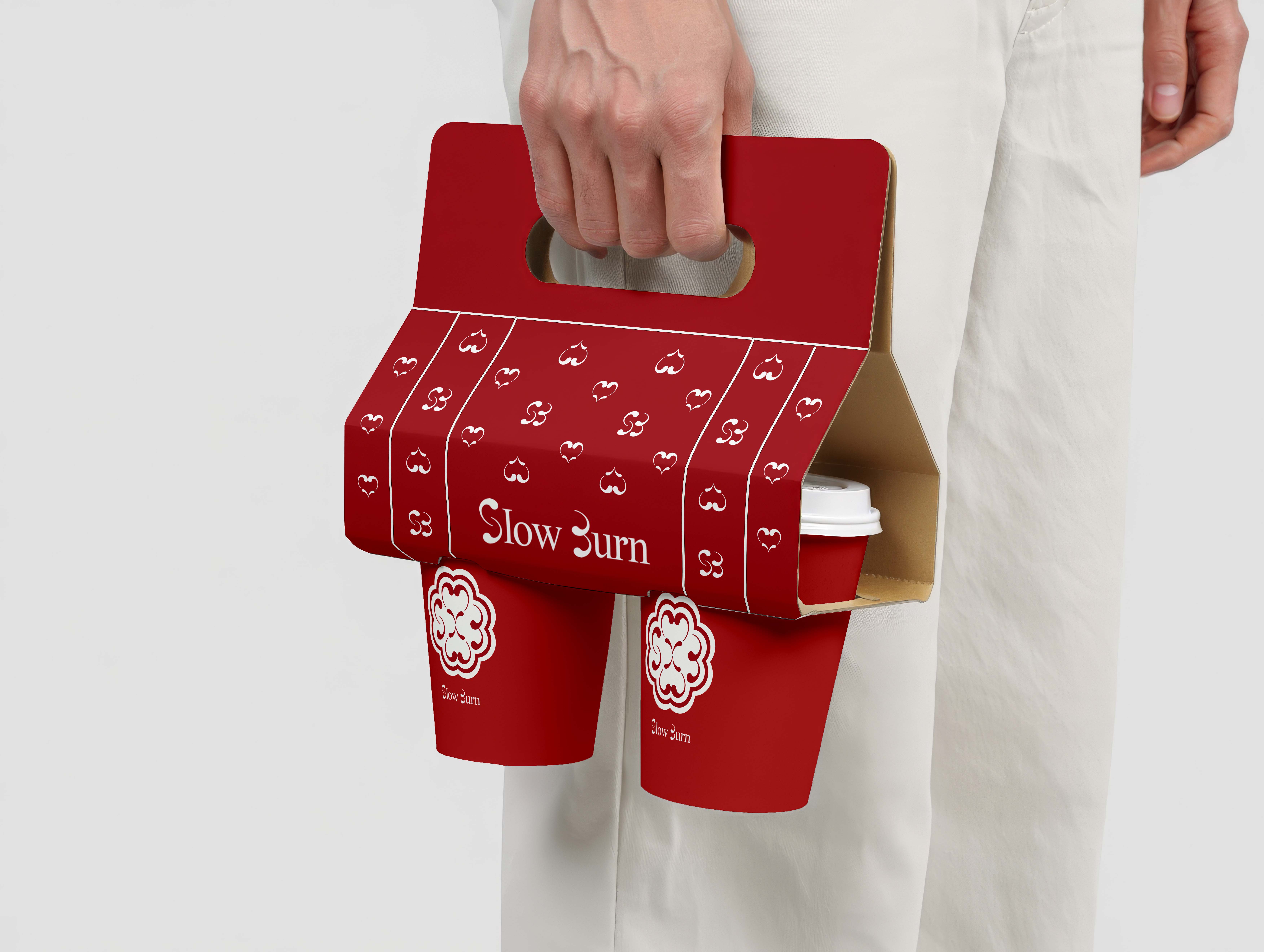
logo concept
The logo is designed as a cohesive shape resembling a flower. Its details include an hourglass, the letters S and B, and a heart, all integrated to represent Slow Burn. The curves and lines create a sense of flow and connection, showing that every part of the design is intentional.